
Automatic Statisticians need Soft Skills
End of February news made the round that Google awarded US$750,000 to “the automatic statistician”, a project at the University of Cambridge’s led by Zoubin Gharamani, Professor of Engineering. The ultimate aim of this project is to produce an artificially intelligent (AI) system for statistics and data science. Automating the process of statistical modelling would have a huge impact on all fields that rely on statistics-, machine learning- or data science experts. Even though it’s easier than ever before to collect, store and combine all kinds of data, there are very few people who are trained in data science methods required to derive models and knowledge from this data and produce predictions. The “automatic statistician” produces a 10-15 page “human readable” report describing patterns discovered in the data and returns a statistical model. Bayesian model selection is used to automatically select good models and features.
Looking at the example reports on http://www.automaticstatistician.com/ it’s easy to imagine how this can be part of the future in data science. A data analytics project involves specific steps and craftsmanship, in a sense that certain processes and specific rules need to be followed. For example when developing a predictive model one would use hold-out samples, cross-validation, look for multicollinearities, filter outliers, transform categorical data into dummy variables and impute missing values. It would be revolutionary to have a tool which would be fed with some cleansed input data and then automatically chooses the best statistical model describing the data. This way some of tedious and error prone work of trying out different statistical models and parameters thereof would be diminished.
But even with the “automatic statistician”, a business aiming to derive concrete actions from data analytics still needs someone who is able to interpret the 10-15 pages report and communicate the insights to management and implementing teams. With systems taking over more of the statistics and machine learning part of data science, communication skills and expertise in the specific vertical become even more important. As John Foreman described in a blog post, which stressed the importance of soft skills in data science, we need more translators to embed the data science processes and insights as deeply into organizations as possible.
Foreman says, data scientist should “push to be viewed as a person worth talking to and not as an extension of some number- crunching machine that problems are thrown at from a distance”. With all the analytics tools and all the data available almost every analytical problem is to some degree solvable. The key skills then is to be able to ask the right questions and to avoid working on a “poorly posed problem”. Working on and solving the wrong analytics problem can happen when someone outside of the analytics team (e.g. management, marketing) describes the problem using their past experience and potential lack of analytics skills and hands over the task to the data scientist as if it is set in stone.
Kaggle is a platform that runs data science competitions and invites anyone to contribute algorithms to solve a specific machine learning problem. In February news broke, that Kaggle is cutting a third of its staff and explores new ways of making money. One could hypothesize that one of the key reasons for Kaggle’s problems lies in seeing the development of machine learning algorithms as something separable from the core business operations. Too much business context is at the risk of getting lost in abstracting the business problem into the "outsourceable" development of an algorithm. Similar to this is the fact that Netflix never implemented the RecSys algorithm that resulted from its renowned $1 Million Netflix Prize. Netflix mentioned changes in their business model and too much of an engineering effort to implement the costly algorithm as reasons.
This emphasizes the importance of having analytics experts with well rounded soft-skills in-house. These kind of business scientists translate between business and data analytics and are a requirement for efficiently embedding a system like the “automatic statistician” in an organization.
Building Data Teams
Below you'll find the slides from a talk I recently gave at the big data meetup in Hamburg in the Betahaus. It's about my lessons learned from building data analytics teams in three different businesses and what I think future developments in the data science/big data sector might be. One of the more relevant teachings is, that unicorns rarely exists.
Marketing Attribution - Part III
Attribution evaluation, cross device switches and offline campaigns
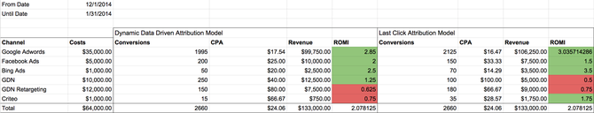
In the last post I described how to develop data driven attribution models. I also explained how to calculate more realistic CPO and ROMI on the basis of these models as the basis for optimizing digital marketing budgets. Evaluating whether re-allocations of marketing budgets on the basis of data driven attribution models actually works is not trivial. It’s not easily possible to ab-test one budget allocation or media plan against another. What could work is testing the previous budget allocation based on last-click attribution CPO in one region and the new one based on data driven attribution modeling CPO in a similar region. For Germany this could e.g. be Munich against Hamburg. But it’s still not a valid ab-test.
A better approach is to make the required changes to the budget allocation. This would then be treated as an intervention and methods of causal inference, to measure whether there was a causal impact, would be applied. I won’t go into the details as they can be read about in this blog post. But ultimately we would use macro-level data (instead of micro-level user-id data) and treat the budget optimization similar to something like a major product release or PR campaign. We would then do time-series analysis to see whether there was a significant deviation from what we would have the time-series forecasted to be.
As I’ve already mentioned in the first post of this series, an interesting problem with doing user journey analysis and attribution modeling on a cookie basis are device switches (e.g. researched on iPad, but bought on desktop) and cookie deletions. Device switches can be dealt with as soon as we have something like a user login to relate different devices to the same user. This should be taken care for by an integrated tracking solution. For example at Jimdo we know that when a user works on her website from her desktop computer and later logs in through the iPhone App that it’s the same user and that there is just one user journey instead of two.
Not properly accounting for device switches could lead to over- and under-estimating the effects of specific channels. Take the following example: there is a mobile campaign on Facebook that never seems to bring in any new sales. This could be because most of the users that saw the mobile Facebook campaign (didn’t sign up, no user login) eventually bought the product on another device. We would underestimate the performance of this particular mobile campaign and overestimate the effect of campaigns that the user might have interacted with before the sale on the same device that she bought the product on.
The macro-data level perspective already described above could be of help here. We could test the impact of our mobile campaigns by reducing the ad spends in these channels and use causal inference to evaluate whether this “intervention” had a significant effect on our sales. If not, there probably wasn’t a significant cross-device effect in the first place.
Macro-level data analysis through time-series analysis and causal inference can also be used for estimating effects of channels where tracking data on a user or cookie basis is not possible. These channels could include tv (as written about here), print, radio or any other type of “offline” channel. For tv analysis GRPs and reach-metrics are being provided by the agency and should be included into the analysis.
Marketing Attribution - Part II
As already mentioned in the last post, accurately measuring all user journeys is a challenge. The tracking solution needs to integrate all channel-clicks (and preferably -views), the ones from cookies that have converted at some point and the ones from cookies that haven’t. Such a system needs to include setting cookies and referrer analysis and combines purchase-data with channel-click data on a cookie-id, i.e user-id basis. It’s decisive for the quality of the attribution modeling to spend sufficient time validating the tracking implementation. Is every campaign and channel interaction being tracked? Are there interactions that are double counted? Comparing the aggregated numbers with stats from Google Analytics or other web analytics tools is useful. But from painful experience I can only recommend to manually test as much as possible. This would include creating fake user journeys, for example by clicking on one's own google ads and test-purchasing a product. Then one should validate whether these actions have been tracked correctly as per timestamp.
For developing an attribution model the conversion event is our binary target variable (customer bought or signed up). The variables about the channel interaction (e.g. number of clicks on “paid search”) are the covariates that predict the value of the target variable.
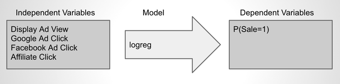
This way the modeling problem becomes a regular classification problem. These types of problems are very common to statistical modeling and machine learning, which allows us to apply proven processes and methods from these fields. These include using training- and test-sets, cross-validation and a set of metrics for measuring model quality. Common metrics for evaluating the quality of predictive models with a binary target variable are AUC (area under the curve) or a pseudo-R-squared.
Since we aim at interpreting the model's coefficient estimates as the effect of each channel interaction, we need to make sure that we have relatively robust estimators. This requires variable selection and eliminating multicollinearity, e.g. through measuring variance inflation factors.
Some seem to achieve good results with bagged logistic regression with regards to having robust estimators (see this paper). Generally speaking different modeling technique can be used such as SVMs, random forests or artificial neural nets.
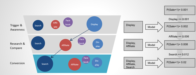
Once we have sufficiently good and robust model in place, we can go ahead and “score” through every customer journey:
Marketing Attribution - Part I
Intro
Digital ad spending in 2014 is approximated to have hit 137 billion U.S. dollars (source). The majority of these budgets are allocated in a suboptimal manner. Mainly because either marketing channels are optimized in an isolated and channel specific way, because performance attribution is flawed or both.
Optimizing digital marketing budget allocations requires a cross-channel perspective. Analyzing touch points and journeys of not only converting users but also non-converting users is key. Understanding the differences in user journeys between user journeys that lead to a conversion and the ones that don’t is important to correctly evaluate the performance of each channel in the marketing mix.
In the first post of this mini-series on marketing attribution I'll first describe the problem, what marketing attribution is and why marketing attribution is such a big issue in digital advertising. In the second post I'll present a solution for marketing attribution which includes statistical modeling for quantifying the effect of different marketing channels. In the last post I want to discuss a system and tool for marketing decision makers which includes a standardized tracking solution and simple reporting view.
Problem
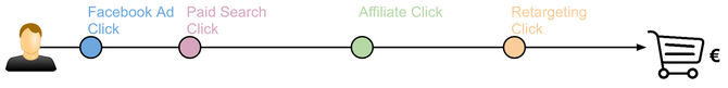
The above image illustrates an exemplary user journey from the first touch point (Facebook ad click) to the last one (click on an organic search result) and the resulting sale. Marketing
attribution tries to answer the question, which contact contributed how much to the eventual purchase. This is crucial to evaluate the performance and derive respective budget allocations. More
budget should be spend on channels that perform well, less on the ones that don’t. There are different types of static attribution models, the following describes the most common
ones:
Simple Multimodal Design Recommender
In the last post I discussed ways to evaluate the performance of recommender systems. In my experience, there is almost nothing as important, when building recommender and predictive models, as correctly evaluating their quality and performance. You could spend hours in preparing the training data, feature engineering and choosing the most advanced algorithm. But it’s all worth nothing if you can’t tell whether your model will actually work or not, i.e. positively influence your KPIs and business processes.
While researching how to implement recommender systems in Python I came across a really interesting and simple example of a recommender published by Yhat: http://docs.yhathq.com/scienceops/deploying-models/examples/python/deploy-a-beer-recommender.html
Yhat offers a service which allows for easy deploying a recommender without having to worry about scalability and server provisioning. The process of deploying a new recommender to Yhat and putting it into production is very simple, if you’re interested I would encourage you to read more about it here: https://yhathq.com/products/scienceops
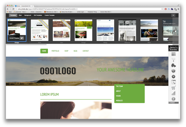
The basis for this demo is an item-to-item similarity matrix. This is being used in order to calculate item recommendations online. I adapted this approach for developing a design recommender at Jimdo. Jimdo is an online website creation and hosting service. At Jimdo we allow our uses to choose from many different designs (as can be seen in the image above) and choosing the right design can be quite time consuming. So we thought of developing a design recommender which would recommend designs to a specific user. The aim is that the user needs less time to find a design that she likes and spends more time adding content.
Following Yhat’s beer recommender example (and that of most item-to-item-recommenders) one would only calculate the similarities for items that could potentially end up in the recommended list of items (in our case the similarities between specific designs). In addition to that, we included attributes that wouldn’t be included in a ranked list, but might be good input-variables/covariates for predicting design-usage behavior. In our case these variables were 1.) whether a user has a free, pro or business account (our three different packages), 2.) which platform language someone chose.
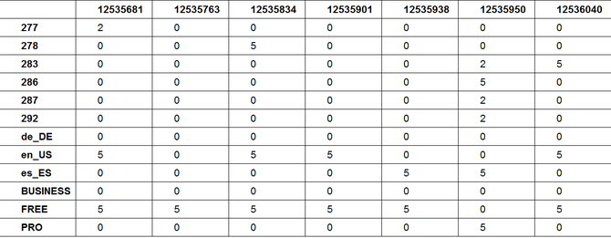
The basis data structure is an affinity table (see below), containing an affinity score for every user towards each of the items and variables. Every column depicts a users affinities. 5 is the highest affinity (user has that language setting, package or has eventually chosen that design), 0 means user has no affinity towards that item or attribute and 2 means she has previewed a design but not chosen it. Since in our case the rating is implicit, meaning the user didn’t give a rating on a five-star-scale, the definition of these affinity values can be seen as part of the feature engineering step. The rows in the affinity table are the specific items and attributes.
Evaluating Recommender Systems

From my personal experience, one of the most important parts of building predictive models and recommender systems is to have robust and straightforward assessment and evaluation systems in place. Splitting your data into training and test sets, developing the model on the training set and eventually evaluating it on the test set is best practice. Besides this simple 2-fold cross-validation there are many other types of cross-validation, which should be applied according to the problem (and size of the available data) at hand.
No matter how complex your recsys is, whether it’s item-base or user-based, programmed in mahout, R, python or SQL, you should always be able to evaluate two completely different recommender against the same set of evaluation metrics. Only then are you able to understand differences in performance and accuracy between recommender algorithms. This is key for choosing the best algorithm for your problem.
Ultimately you want to test if your recommender positively impacts user behavior by conducting a split-test and measuring incremental changes in your KPI of choice (sales, active users, clicks). But before one can evaluate the recommender online, i.e. with real users, one should be sure to have developed the best recommender possible and assessed it’s quality offline.
In the following I will describe three popular evaluation metrics for recommender systems through examples. Those metrics take into account the order of the recommended items:
Mean Reciprocal Rank (MRR)
MRR evaluates recommender that produce a list of ranked items for queries. The reciprocal rank is the “multiplicative inverse” of the rank of the first correct item. For calculating MRR the items don’t have to be rated. MRR doesn’t apply if there are multiple correct responses (hits) in the resulting list.
Causal Impact in Time-Series
As a data analyst you are often tasked with finding out the impact of an intervention (action, campaign, product release etc.) on some KPI. It’s “easy” when you are able to set up an ab-test and measure incremental gain/loss between control- and test-group. Implementing ab-tests (aka. split-tests, randomized experiments or hypothesis tests) should always be the number one choice for trying to measure causal impact of an action. In my view one of the most important jobs of a data scientist is to evangelize ab-testing as one of the cornerstones of becoming data driven.
There are scenarios where implementing ab-tests is not possible, for example TV campaigns or mobile app releases. In this case it’s tempting to resort to looking at graphs of the KPI before and after the intervention. For example, if a TV campaign was aired in April 2014 one could compare the sales increases from March to April 2014. To get a grip on seasonality these could be compared to the sales increases from March to April in 2013 and 2012. This is most likely better than nothing. But the problem with this is that it doesn’t take into account developments that might have led to the number of sales in March and differences in absolute levels. For example, March sales were on a high level in 2013 because of a successful product launch and sales decreased in April 2013 by -x%. If sales increased slightly from March 2014 to April 2014 by y% than it’s tempting to say that the absolute effect is x+y%, which of course is wrong.
Another method could be to do time-series-analysis (e.g. in R: http://www.statmethods.net/advstats/timeseries.html) and try to “forecast” how sales would have looked like, if there wasn’t an intervention. The forecasted time-series could be seen as a synthetic control and once compared to the actual number of sales gives an estimate of the sales-impact the intervention had. The validity of this approach of course depends heavily on the quality of the time-series-analysis and forecast accuracy. But given a sufficiently accurate forecasting-model this approach is preferable to the simple “before-and-after” analysis described above.
In September Google published “CausalImpact”, which is a new open-source R package for estimating causal effects in time-series (http://google-opensource.blogspot.de/2014/09/causalimpact-new-open-source-package.html). The aim of the package is to solve the problem of estimating the effect of an intervention when an ab-test isn’t available. Simply put, it is based on the before mentioned approach of producing a synthetic control via time-series modelling. In addition to that, it incorporates control time-series which predict (correlate with) the outcome of the time-series in the period before the intervention to produce the synthetic control. For example if the above mentioned TV campaign was aired in April 2014 in Germany only, than adequate control time-series could be the number of sales in other countries, e.g. the US or Japan.
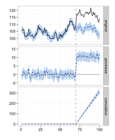
The plot on the left displays the result of the CausalImpact-package: Given an intervention at time point 71 the model predicts the expected time-series if there wasn't an intervention (the dotted line in the diagram labeled original).
The difference of the predicted (dotted line) to the actual time-series (solid line) is the effect of the intervention, which is displayed per time-point (pointwise) and cumulative.
It’s important to choose control variables that are not affected by the intervention. Choosing sales from countries such as Switzerland or Austria, which might have been impacted by the TV campaign Germany could result in invalid estimates.
This package is based on Bayesian structural time-series models and applies Markov chain Monte Carlo algorithms for model inversion. The paper is available here: http://static.googleusercontent.com/media/research.google.com/en//pubs/archive/41854.pdf.
Validating ones assumptions is critical when doing this kind of causal analysis. As already mentioned, it’s important to check that the incorporated control time-series are not affected by the intervention. Secondly, one should understand how good this approach can predict the time-series in question before the intervention, in the TV campaign example the number of sales in Germany before April 2014. Using a fake intervention, say in March 2014, one would expect not to find a significant effect for this period, since there really was no intervention.
It’s probably tempting to only use this kind of approach and disregard ab-tests altogether. One could argue that the costs for implementing ab-tests might be higher. But I would always prefer an ab-test over doing time-series analysis. One of the many reasons is that ab-tests can control for external local impacts such as weather or special events, which this time-series-modelling can’t.
We used the CausalImpact-package to assess the effect of a recent TV campaign at Jimdo. Interestingly, the simple before- and after-comparison would have underestimated the impact compared to the analysis with the CausalImpact-package.
Top 3 of Growth Hacking
We started a growth hacking initiative at Jimdo and had interesting discussions on what the scope of growth hacking actually is. I went through my related bookmarks and thought it might be useful
to aggregate the top 3 cornerstones of growth hacking.
As a start, citing Aaron Ginn’s (@aginnt) definition from a
whiteboard article seems useful:
growth hacker (noun) – one who’s passion and focus is growth through use of a testable and scalable methodology.
A growth hacker works within the parameters of a scalable and repeatable method for growth, driven by product and inspired by data. A growth hacker lives at the intersection of data, product, and marketing.
Now that we have a definition in place let's get started with the top 3 elements of growth hacking:
1. Passion for growth manifested in data and tests
What is common to all the relevant growth hacking definitions is the mentioning of testing, reproducibility and scalability. Designing and evaluating split-tests, to measure whether a specific action actually moved the needle, is an essential part of growth hacking. Without data there is no validated learning and not a single iteration through the build-measure-learn cycle. Interestingly, this scientific approach is also an important part of data science, as I have described here.
In this TechCrunch post Aaron Ginn describes that “growth hackers have a passion for tracking and moving a metric. Without metrics or data, a growth hacker can feel out of place and uncomfortably exposed. This strong bias towards data drives a growth hacker away from vanity metrics towards metrics that will make or break the business.”
Some believe that you should only call yourself a growth hacker once you achieved significant and proven growth. Apparently it’s easy to be called a growth hacker in a company with an awesome product that's already growing exponentially. The company will most likely grow no matter what you do. Being able to indicate through AB-Tests which part of growth is actually due to growth hacking efforts is key for sustainable growth.
2. Applying the AARRR-Funnel
The below embedded slide deck from Mattan Griffel for me is the most practical “tutorial” on growth hacking. I think Dave McClure’s AARRR-metrics (see video below) are really useful to map and identifiy a growth companies biggest potentials. Mattan Griffel references the AARRR-metrics a lot and emphasizes that “the growth hacker’s job is to figure out how to move users from one state to the next [within the AARRR-funnel].” It’s important to focus on the right step in the AARRR funnel, you shouldn’t work on optimizing user acquisition if your activation rate is 1%.
Two-sided vs. One-sided Test evaluation
Split-Testing is one of the really sciency parts of data science. It is one of the few methods to identify causality and create knowledge (see this post). On the other hand there are numerous ways to mess up your test design, the test implementation and the test evaluation (see this post).
Sometimes the pressure is quite high to produce test results with a significant positive improvement. Especially in a consulting-client setting consultants might be under a lot of pressure to show significant results.
I've experienced many situations where organizations start to doubt the effectiveness of ab-testing because there weren't any significant test-results. Instead of questioning the tested actions, product-changes or even capabilities of product-owners it is easier to "shoot the messenger", stop ab-testing and release features that don't affect the bottom-line.
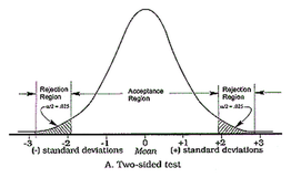
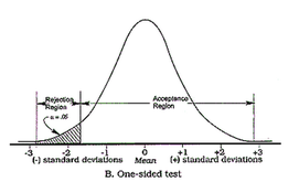
One really common trick for p-hacking and for making ab-test results "look" significant is to decide after the test-start to evaluate them on a "one-sided" basis. This leads to the p-value being only half of what it would have been in a "two-sided" evaluation. Eventually it deceives the researcher by indicating seemingly significant results more often.
Without going too much into the details, evaluating a test only on a one-sided basis changes the original alternative-hypothesis. For example from "the new feature will lead to a change in the number of sales" to "the new feature will lead to an increase in the number of sales". The only justification for using the one-sided version, i.e. only checking for increases, would be, that decreases in sales aren't of any interest (see this paper for more information on this). This in my experience is almost never the case.
So be aware if someone tells you that the test results are significant when evaluated "one-sidedly". But you should run away if someone evaluates the test "one-sided", doesn't tell you so and only announces that the test resulted in significant improvements.
Visual Website Optimizer, a provider of a web analytics and testing tool, has this split-testing significance calculator on their site: https://vwo.com/ab-split-test-significance-calculator/
Guess what method they use? Right, one-sided. Take the following example: 1000 users in your control group and 1000 in your test group. In the control group there are 21 conversion and 34 conversions in the test group. The tool would tell you that this is a significant result since the p-value is smaller than 0.05 (p-value=0.038). But evaluating this test correctly on a two-sided basis would result in a p-value of 0.076, which is not a significant result.
Visual Website Optimizer could argue having chosen a lower confidence-level than the standard 95% to increase the test's power. The greater risk of falsely accepting the alternative hypothesis might be to not notice when an action is actually successful (see type II error and statistical power). But not explicitly stating this decision raises some questions.
A much better, albeit more complex significance- and sample-size calculator is the following: http://www.evanmiller.org/ab-testing/sample-size.html. This also demonstrates the interdependence between type I- and type II-error, sample-size and effect-size.
Are Facebook's algorithms making us unhappy?

Facebook had 829 million users in June 2014 who logged in every single day (DAUs, daily active users) (Source: Facebook's latest quarterly). There were 1.32 billion monthly active users (MAUs) as of June 30, i.e they were active at least once in June 2014. That is approx. 19% of the world's population or 47% of the part of the population that is on the internet.
There is significant evidence that suggests that Facebook use leads to negative shifts in how people feel and how satisfied they are with their lives. Researchers suspect that Facebook catalysis social comparison and envy.
Furthermore it seems that Facebook can actively change its users emotional state by tuning the Edge Rank Algorithm. A widely publicized, massive experiment with 689,003 Facebook users provided evidence that emotional contagion takes place without direct interaction between users. Only being exposed to a Facebook friend's post in the news feed is sufficient for emotional contagion to take place. The researchers reduced the amount of emotional content in the News Feed. The result was that "[w]hen positive expressions were reduced, people produced fewer positive posts and more negative posts; when negative expressions were reduced, the opposite pattern occurred."
So not only does Facebook usage itself lead to negative impacts on how people feel and how satisfied they are with their lives, but Facebook can deliberately catalyze the negative emotional shifts towards being depressed and having doubts by tweaking the Edge Rank.
This gets really interesting in the following context. Research shows, that people with doubts about themselves and their self-worth are more prone to materialism and consumerism, i.e. are more likely to buy "stuff". But it's not only that we are more inclined towards consumerism and materialism when we are unhappy, but also the other way around. Related studies show that materialism seems to negatively impact our wellbeing and satisfaction. For example because chasing after material wealth interferes with our social life. Strong consumerism can promote unhappiness because it takes time away from the things that facilitate happiness, such as time spent with family and friends. This emphasizes the systemic nature between materialism and consumerism on the one side and unhappiness and negative emotional states on the other, which one could assume work in a self-reinforcing, cyclic interdependence. This is not some kind of leftist critique of consumerism, but scientific results published in some of the more renowned psychology journals.
In light of these interdependencies the following hypothesis could be developed. People on Facebook might be more inclined to consumerism when in a negative emotional state. Thus they are more likely to click on ads and buy through the Ads displayed on Facebook. Facebook as a public company is obligated towards its shareholders to maximize revenue and profits. The vast majority of these revenues stems from selling ads. Facebook needs to find ways to maximize the number of ads being sold to advertisers. Advertisers are willing to spend more on Facebook if the revenue or number of sales that can be attributed to Facebook ads increases. So Facebook could alter its users emotional state to make people feel depressed in order to sell more ads, increase revenue and profits.
I am not implying that somebody at Facebook actively decides to make its users unhappy. But the machine learning algorithms, that are the basis for the edge rank and the ad targeting at Facebook, could automatically optimize themselves towards negatively impacting people's emotion.
Facebook is obviously willing to compromise its users' emotional wellbeing through a massive experiment for the sake of science. With this in mind, it doesn't seem like a far-fetched conspiracy theory that Facebook's data science team might not stop their algorithms from learning that unhappy users click more. Facebook's algorithm might decrease user's happiness for the sake of profits.
It would have been quite interesting to see whether ad revenues were actually higher in the group from the Facebook experiment that was shown negative posts. That could have been a quantitative validation for the thesis that unhappy people are more inclined towards consumerism. But unfortunately that information wasn't detailed in the experiment's public paper, even though I am pretty sure that the researchers at Facebook definitely looked at how much such a massive experiment impacted their core KPIs and bottom line.
Data to the people - part 3
In the last "data to the people"-post I described the kind of basic analytics classes we conduct at Jimdo, which aim at empowering colleagues to query our data warehouse with basic SQL.
Additionally to this and the SQL Lean Coffee Session we conduct, we also provide more advanced SQL classes. In these advanced classes we look into joining tables and aggregate- and OLAP-functions.
The next step in our efforts for data democratization is to run more advanced analytics classes which go beyond SQL. There will be one for colleagues more interested in advance analytics with Excel and another one which will aim at doing analytics with R. The below diagram summarizes the different analytics classes that are being offered at Jimdo.
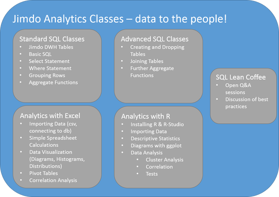
Many might view Excel as the most anti data sciency tool to use for analytics but in my experience it is the most widely used data analytics tool and pretty damn powerful. I would even bet that the majority of profitable insights generated through data analytics come through some sort of Excel Analysis. People who laugh at others using Excel are probably the same that roll their eyes at data scientists using "traditional" SQL databases. I always found this kind of dogmatism unprofessional, why would someone voluntarily narrow his toolset for the sake of hipness?
This is why I love John Foreman's book "Data Smart". He explains many of today's standard machine learning algorithms using Excel and only at the end points towards doing analytics in R.
The Excel class will cover the basics of importing data into Excel, spreadsheet calculations, data visualizations. We'll also go into the powerful Pivot Tables and demonstrate how easy it is to view a specific data set from many different perspectives. Finally we'll also do some simple correlation analysis to dig into more advanced data analysis.
The analytics with R classes will be based on R-Studio since working with this R-GUI will probably make the adaption a lot easier. We'll cover how to import data and and produce first simple descriptives statistics.
Visualizing data with ggplot will be one of the main topics of this R class. We'll explain how to analyze and display data distributions with histograms, boxplots and probability density functions.
Understanding different types of correlation analysis and basic cluster analysis will allow participants to start analyzing relationships between variables. This will be round off by some simple Test Analysis.
The introduction to exploratory data analysis will include common pitfalls to watch for. There we'll be an emphasize on always visualizing relations between variables, for example with Scatterplots. Anscombe's Quartet (http://en.wikipedia.org/wiki/Anscombe's_quartet) will be introduced to demonstrate how misleading simple statistical properties can be and why visualization is important.
Most importantly we will stick to examples from our daily work. So we won't go into the theory concerning different clustering or correlation analysis algorithms but rather explain in the form of cook book recipes which methods are best suited for which use cases. We'll also only use real work examples instead of any type theoretical data. In my experience clean and well formatted demo data (e.g. the notorious iris data set) is ok to understand a specific method, but hides the pitfalls that one will encounter when working with messy real life data.
Further developments regarding these analytics classes could include predictive modelling, timeseries analysis or even developing recommender systems. But the short term goal is to get as many Jimdo colleagues as possible to do standard data analytics regularly. This way Jimdo will become truly data driven.
You're the expert
I bet every data "expert" who ever had to directly work with clients lived through this before... Especially if in a marketing orientated environment.
Here is a list of my favorite "you're the expert" experiences from meetings with clients or colleagues:
- We know the results of calling 12 users aren't statistically significant, but they are still really interesting and we are going change our strategy because of them.
- "We want you to be more innovative, creative and try out new things" -> after trying out something new -> "don't waste my budget on innovation"
- We did a lot of tests to increase KPI xyz, but they all didn't work. Therefore we think it's the wrong KPI.
- "Why can't we just compare the number of new payers we get after we did xyz with before we did xyz?"
- "Retargeting works great, we shifted all of our online marketing budget into it." -> one month later -> "There weren't any new users we could retarget anymore, retargeting doesn't work."
- Woooaaaah, it's like you guys can look into the future.
Actionable insight instead of data pucking
In this post Jawbone's data team suggests 7 to be the magic number for how many hours of sleep are optimal. Quite an interesting analysis, at least the results seem to be more of an actionable insight than pure data pucking (which I talked about in this post).
I understand that this kind of data porn is targeted at mainstream consumers as part of the marketing mix and that showing data distributions would overload these people. Still I would have loved to see some more advanced analysis results, e.g. what kind of clusters exist, what is the distribution of sleeping hours etc..
Statements like "members who sleep an average of 7 hours per night are 16% more likely to report feeling more energetic the next day" make my head spin a little (do they report this when they have slept the average hours of 7, more, less, etc.) and I think a hint towards not mixing up correlation and causality would be appropriate here (if this analysis wasn't aimed at mainstream consumers). But overall the results of this analysis is an actionable insight, I will aim for 7 hours the next couple of nights.
Data to the people - part 2
So as I have explained in the first post in this "data to the people" series, I really think that anyone who wants to do data analytics and isn’t afraid of numbers actually should do data analytics. Related to the wisdom of the crowd paradigm, my opinion is that more people doing data analytics will be better than less.
In this post I'd like to give the first few concrete examples of how to achieve this, specifically within a company.
At Jimdo we started by giving analytics classes to colleagues who were interested. We as a datateam provide a self service data warehouse based on aws redshift, which is basically an extract from our base data warehouse. Instead of continuously working on a series of adhoc-queries (e.g. to find out how many paying user we have in a specific city) we decided to give our colleagues the tools to answer these queries autonomously themselves. We didn't want to be the data princelings who act as gatekeepers to the valuable data-treasure that we have, as Avinash Kaushik has described in this highly recommended talk.
Most importantly these analytics classes we really hands on, i.e. we didn't try to give a tutorial on SQL or even go into the details of relational databases. Instead we tried to be as practical a possible. We only worked with examples of queries that other colleagues have actually worked on.
Before we started with this Self Service SQL and data analytics classes we didn't know at all what the adoption-rate would be and how many of our non-technical colleagues would actually start working with SQL regularly. The results were quite intriguing: as expected, some colleagues who participated in our data analytics classes never afterwards worked with the datawarehouse. But many did and started integrating database queries in their daily workflow. There's even a repository of most-used sql-queries which is being managed by a group of non-technical country managers. One of our co-founders who has never before worked with SQL and is more of a business-type just published a report on how our mobile app usage looks like onto our company's yammer. Guess where he got the data from?
Additionally to the Beginner's SQL classes we introduced an "SQL Lean Coffee". Two members of the data team would be available for about an hour to go through specific SQL questions which are then being discussed with all attending colleagues. This works quite well, allows for open discussions and complements the standard classes.
One of the motivations for starting with Self Service SQL and these analytics classes was to be able to deal with the immense amount of adhoc queries that flooded the data team. By now enabling many colleagues to directly query our data warehouse is one of the cornerstones to make Jimdo truly data driven.
In the next post I will explain how we are developing more advanced analytics classes for our colleagues with existent SQL skills. Quite a few of our software developers have shown interest in topics such as data visualization and cluster analysis.
In the mean time, If you want to know more details about these analytics classes, think about doing them in your organization or just want to exchange your thoughts and experiences please feel free to contact me.
Wow! Data Science is Dead!
Miko Matsumura (VP at Hazlecast) writes in this post that Data Science is dead! Amongst all the hype around data science this is quite a controversial statement. But Miko has some thought provoking points, albeit his definition of what a data scientist does is very narrow. It seems that in his definition a data scientist is someone who only queries data via sql, which differs quite from the definition of data science that I find useful.
In his first paragraph he argues that "Science creates knowledge via controlled experiments, so a data query isn’t an experiment. An experiment suggests controlled conditions; data scientists stare at data that someone else collected, which includes any and all sample biases."
I would argue that data scientists should be directly involved in designing, implementing and evaluating experiments. Every data science team I was part of had an invested interested to know and eventually take part in redesigning the process through which the data in the databases is being collected. For example at Jimdo every data scientist could point out directly the location in Jimdo's source code where the data that we analyze is being created through the interaction of the user with the product. We even designed and implemented a whole new tracking process of to more granularly track our user's behavior and conduct experiments on this data (Matter of fact, I am just in the process of validating this new data collection process). So in Miko's logic, because we are not removing ourselves from the process of collecting data, we are not data scientists?
Back before data science was called data science, kdd "knowledge discovery in databases" was quite a thing. A classical process in data analytics(/science) would involve forming a hypothesis by doing some sort of explorative analysis in your existing data (that might have been collected by someone else, e.g. the product and user), and then test the respective null-hypothesis through an experiment under controlled conditions. The test would be designed and implemented by a data scientist. This way one would "build and organize knowledge in the form of testable explanations and predictions about the universe [company/organizatio]" (Source: http://en.wikipedia.org/wiki/Science)
Another thought provoking statement is the following: "There is going to be a ton of data in the future, certainly. And interpreting that data will determine the fate of many a business empire. And those empires will need people who can formulate key questions, in order to help surface the insights needed to manage the daily chaos. Unfortunately, the winners who will be doing this kind of work will have job titles like CEO or CMO or Founder, not “Data Scientist.” Mark my words, after the “Big Data” buzz cools a bit it will be clear to everyone that “Data Science” is dead and the job function of “Data Scientist” will have jumped the shark."
I've seen quite a lot of data scientists who directly optimized business processes and helped managed the daily chaos by asking and answering the right questions through data analytics. From focusing and optimizing the right AARRR-metrics (which again involves AB-Testing), to developing whole new lines of businesses' as well as creating Recommender Systems with a direct impact on a companies bottom-line, data scientists don't need to be C-Levels or Founders to rock an organization.
Though I would rather disaggree with most of Miko's statements, I definitely second part of his concluding remarks, where he says that "when you talk to Master Data Management and Data Integration vendors about ways to, er, dispose of that [Big Data-]corpse, you’ll realize that the “Big Data” vendors have filled your executives’ heads with sky-high expectations (and filled their inboxes with invoices worth significant amounts of money). Don’t be the data scientist tasked with the crime-scene cleanup of most companies’ “Big Data”—be the developer, programmer, or entrepreneur who can think, code, and create the future." I would just like to add that it doesn't really matter what title these developers, programmers or entrepreneurs have, even if it is data scientist.
Data to the people - part 1
As has been suggested in this summary, the theme of this years Strata was “data demystified”. I really enjoy reading about all efforts and shifts from taking the “magic”, “scienceness” and “academia” out of data analytics. In my opinion there are still too many people who want to make data analytics look a lot more complex than it is, only for an elite of the brightest of the bright to be worked on. (Similarly there are too many people talking about data science or big data who have never fired a single sql or done a correlation analysis, but that’s another topic).
I’d like to think of data analytics eventually being something that everybody who wants to do actually can and should do, given that they have a good understanding of numbers, don’t hate math and are willing to put in some effort to learn the basics.
I had enough of reading posts from PhDs and other academics who seem to perpetuate this notion of data analytics being something that is only for “true data analytics experts” and people who spent years at university. This blog post suggests that people only should use p-values if they have “proven” competency in statistics and and data analysis. Every company I worked for so far has benefitted from having more people talking about statistical significance and p-values than less. Even if some of the colleagues haven’t completely understood p-values and their pitfalls, they at least started thinking about what statistical significance means and stopped only looking at differences between means.
Another example of these “data anlytics only for experts” sentiment is this article. Here the prepartion of the modelling data by separating it into test and trainging sets is given as an example for one of the hard parts of data analysis, one with many potentail pitalls and only for the true expert. Yes, but so is driving a car at 200 km/h on the autobahn. In my view it’s a really artisanal task, with specific rules one has to follow which can be learned through practice, not necessarily only through studying (I honestly think that someone who has been in a car accident and experienced the immense force of heavy object coliding is better suited to drive his car at 200 km/h than someone who hasn't).
Blog posts like these seem to suggest that academic and detailed knowledge about analytical methods and algorithms is required and that one has to know linear algebra to be able to work as a data scientist. More often than not they recommend a bunch of books and online courses that one should go through before continue working...
Having read a bunch of statistic books and knowing about linear algebra is generally a good prerequisite for being a data scientist. But it’s not nearly enough, nor is it the most important part. Speaking for myself, I tend to forget details about specific algorithms one day after I heard or read about them (latest). How does the Logit-Transformation for a logistic regression exactly look like? How does Deep Learning differ from artificial neural nets? What’s the difference between linear and non-linear kernels in SVMs? I’ve learned linear algebra, but for my daily work as a data scientist it is as useful as knowing assembler to a ruby dev.
For a data scientist to generate business value it’s more important to have a broad but not necessarily deep knowledge of the different fields of data analytics, data mining and machine learning. The key skills of a data scientist is to be able identify the correct problem to work on, then source the necessary data and think about important variables, be able to find an appropriate (not the best) algorithm and effectively communicate the results. Without being able to integrate data science results and processes into the existing organization, by understanding the business process already in place and communicating effectively, data science teams will be something of an academic ivory tower. They might make no methodological mistakes and know all about the details of specific ml-algorithms, but they do not increase profits.
“Anyone who knows me well knows that I’m not the sharpest knife in the drawer. My quantitative skills are middling, but I’ve seen folks much smarter than me fail mightily at working as analytics professionals.” This is from John Foreman, chief data scientist at mailchimp and someone I would regard as pretty damn smart. John argues in this highly recommended blog article, that soft skills matter quite a lot in data science, especially to really understand the problem.
Similarly, Kaggle CEO Anthony Goldbloom says the following in an article that discusse how the most successfull data scientists are not necessarily PhDs: “In fact, I argue that often Ph.D.s in computer science in statistics spend too much time thinking about what algorithm to apply and not enough thinking about common sense issues like which set of variables (or features) are most likely to be important.”
Years ago during my time at XING, we had a meeting with some PhDs from DFKI (German Research Center for Artifical Intelligence) as we tried to figure out how to best machine learn about the different tags and their associations that a member enters to describe his profile (e.g. “data mining”, “machine learning” etc.). We used ordinary association- and lift-Analysis to determine the relation between any two tags, and discussed ways to calculate the relation between any n-tags towards another set of tags. So for example, what tags should I be interested in if I have the tags “data science” and “big data”? Eventually my team came up with the idea of just adding the single Lift-Values for the 1:1 relations up, which worked very well and bested the job recommender engines that were in place until that day. Recommendations with this method were not only performing better, they were less expensive to calculate and more universally applicable (we were able to calculate association between any types of items on xing). The only theoretical problem: the calculation, adding up Lift-Values, is mathematically incorrect! Did we care? No, because they were proving to generate more value to the business in every single split-test that we ran. Here is the link to the paper which describes the early version of tag-based recommender system.
I am not saying that any kind of specialized knowledge about different machine learning algorithms is unnecessary, but I think that data science and specifically predictive modelling is being portrayed as something way more complex than it actually is. There are really robust and proven ways (from when data science was called data mininig or BI and big data was called data) to make sure that mistakes in your predictive modelling don’t ruin your business. These include:
- Deviding the data your develop your model on into traininig- and test-sets. Model/Train on the training data, evaluate on your test data by looking at R-Square, ROC-Curves, AUC, AIC etc.
- Have other, complete distinct validation data sets, evaluate model performance on this set as well
- Test your model on real data, evaluate performance, look at score-quantiles (did the users with a high predicted converison score really convert more often than the others?)
There are frameworks which integrate these steps into an industrialized process for developing predictive models, for example SEMMA and CRISP which both originate from a time when the term data science and big data didn't really exist. Sometimes it helps to realize that there were many companies making millions with what is now called data science before the hype, but this again is another topic.
Some of the algorithms being applied today are so complex, that without these simple validation steps they couldn’t be implemented at all. For example the models being produced by SVMs and Artificial Neural Nets are more like a black box compared to logistic regression or decision trees. Only after validating their performance on different test- and validation-sets one should consider implementing them in practice.
On the other hand, methodological errors occuring while training a model will be uncovered easily, for example if the model performed very well on the test set, but seems to overfit on validation sets from other timeframes.
Having gone through this process for developing robust predictive models many times with real data in a real business in my view is far more important than knowing about how one would best implement a decision tree with map reduce or the latest trends in deep learning. In the last summer we interviewed a dozens of really intelligent data scientists for a data science job. Most of them with a respective PhD, some of them worked on amazing research projects. But asking them to transfer their knowledge onto a realistic business problem that we faced often resulted in a really akward moment of silence. Many solution were so theoretical that we never could have implemented them. What was even worse, there wasn’t really an informed discussion taking place. I’d rather hire someone with a proven track record of having applied data science algorithms and methods on real business problems than someone whose papers have been cited more than a 100 times but can’t transfer her knowledge into a new domain.
In one of the next blog posts in this “data to the people” series I’d like to talk about tools and practical examples of how to democratize data analytics. One of these include teaching our colleagues at Jimdo how to do analytics and querying our data warehouse with sql. This led to one of our non-technical Co-Founders typing sql regularly and even publishing the results internally.
P-Value Devoutness
Great article on why one shouldn't think p-values are the gold-standard when it comes to evaluating experiments and hypothesis-tests: http://www.nature.com/news/scientific-method-statistical-errors-1.14700
It proposes to report effect-sizes and confidence-intervalls when reporting (publishing) results of experiments and tests. Additionally one should look to evaluate tests not only the "frequentist" way but also incoporate bayesian evaluations of tests. The following links are good tutorials on how to do this in R:
http://www.win-vector.com/blog/2013/05/bayesian-and-frequentist-approaches-ask-the-right-question/
http://www.sumsar.net/blog/2014/01/bayesian-first-aid/
The nature-article also talks about p-hacking, but doesn't go into detail about the specifics on how to hack your p-value. A common mistake is to look into the test-results on a daily basis and to stop the experiment whenever a p-value smaller 0.05 has been reached. Multiple comparisons is a huge issue when looking at p-values of a test.
The best summary on all the fallacies on can encounter while doing ab-tests is this: http://www.evanmiller.org/how-not-to-run-an-ab-test.html
So in summary this is an aggregate Dos/Donts-List on how to properly evaluate and report split-testing results:
- Report the test's power, confidence-intervalls and effect-size, never only the p-value
- Use more than one perspective, evaluate the test on a p-value basis (frequentist-approach) but also with a bayesian approach
- Use intuition and talking to experts as a third perspective
- Don't test hypothesis that seem interesting but that seem to have odds of being true that are very low
- No p-hacking: Determine before starting the test when you'll end and evaluate the test
- No p-hacking: Dont' look into the test results before the pre-determined end of the test
- Avoid multiple-comparison problems by testing only one hypothesis at once (not more than one test-group)
- Last but definitely not the least important: AA-Test, check how valid your randomization-process, i.e. your test-/control-group assignment is
Quantified Self - more than data pucking?
There’s a huge amount of data generated by all the quantified-self apps and devices. From basic data about one’s activity and health, such as heart rate and number of breaths to the height and duration during jumps while kiteboarding. But most of these device/apps just display data as simple stats and diagrams, for example your sleeping or activity patterns over time.
Of course that’s interesting and helps to understands ones own sleeping behavior. But it’s the same kind of ineffective data puking that happens in so many companies, it doesn’t lead to really valuable insights and actions. As data scientist Dj Patil argued in his talk at Le Web, we are really good at gathering data through ever smaller, faster and more precise sensors. We are also quite awesome in processing these massice amounts of data with things like map reduce, real time stream processing etc.. But we still really suck at generating insights and actions.
Why not use established statistical modelling techniques to generate these insights and recommendations for actions? If I would be wearing a quantified-self device I would like to be warne that I would get sick if I won’t start running more regularly depending on the weather or that I should go to bed before 10pm tonight to avoid catching the flu.
I would like to be reminded early enough that I should start running more at the beginning of winter time since I tend to get depressed due to the lack of light. Or how about which activities and meals during the day lead to better sleeping patterns in the following night? If I just started wearing the device and there isn’t enough data on my activity and sleeping behaviour to generate significant patterns and insights, why not use the aggregated data of all other users who were the same device?
To take this further and ultimately find the patterns that lead to the highest level of happiness, it would be interesting to integrate data about how a person is feeling (happy, depressed, anxious, relaxed etc.). Other interesting data point could include how much time a person spends being mindful, has invested into meditating, yoga, praying etc.. These types of data would be highly subjective information, but I could still see how this would be standardized and could to lead to more meaningful insights.
It will be interesting to see if there is going to be some standard presentation of quantified self data and whether APIs will be provided for retrieving data from different devices and synchronizing it. Or whether the device vendors will try to lock users in, own this valuable data and all the insights and recommendations for actions that could be derived. The Former could lead to a whole range of new enterprises that integrate data from all kinds of different devices on their quest to solve an individual’s happiness formula, including even seemingly unrelated data such as to what websites have been visited or what which TV shows have been watched.
Up until now it seems as if only engineers and data scientist have managed to pull the data out of the quantified-self devices to do some advanced analysis on it. For example Dan Goldin imported his runkeeper data into R and correlated the distance of his runs with the speed:
http://dangoldin.com/2014/01/04/visualizing-runkeeper-data-in-r/
Last year Jawbone hired ex-linkedin data scientist Monica Rogati (@mrogati). It will be interesting to see how much further she will move Jawbone from pure reporting of existing numbers and stats towards insights and actions.
Here you’ll find some more interesting links related to the quantified self movement, devices etc.:
- Stephane Marceau on the OMsignal Sensing Shirt: http://vimeo.com/82215891
- Getting your data out of the Jawbone: http://eric-blue.com/2011/11/28/jawbone-up-api-discovery/
- http://quantifiedself.com/
Devices/Apps:
- https://jawbone.com/up/international
- http://www.fitbit.com/
- http://www.nike.com/us/en_us/c/nikeplus-fuelband
- http://xensr.com/
- http://www.omsignal.com/
- http://lark.com/products/lark/experience
GIGO (Garbage in, garbage out)
A recent paper published by researchers from Princeton predicts that “Facebook will undergo a rapid decline in the coming years, losing 80 percent of its peak user base between 2015 and 2017”. Their modelling approach included an epedemic model, the so called infectiopus recovery SIR model (irSIR).
Actually the modelling approach doesn't really matter, since the real problem with their analysis is the input data they use to do this forecast: Google trend data. The same data that Google also applies to estimate flu activity around the world, quite precisely. They use the number of searches for "Facebook" as a proxy for user activity, because it's publicly available. This is the problem with so many data sciency analysis: a more or less advanced modelling approach is chosen, that hides the most crucial aspect of the whole analysis, the input data. I've seen this behavior many times, "hey, we only have access to this dubious data, but let's use this fancy algorithm on it so everybody thinks we're really smart and won't question the validity of our analysis"...
The authors of the paper argue that "[t]he public nature of this data is an important feature of the approach used in this paper, as historical OSN[Online Social Network] user activity data is typically proprietary and difficult to obtain", which basically means that they chose this data because they didn't have access to better data. Furthermore "the use of search query data for the study of OSN adoption is advantageous compared to using registration or membership data in that search query data provides a measure of the level of web traffic for a given OSN". They should detail, that it provides a measure of the level of web traffic coming from google. What they fail to prove/discuss is if it's a reliable proxy for Facebooks whole traffic and user activity.
Google trend data is aggregated Google search data, now please step back for a moment and think how good that data describes how active Facebook's users are/will be. Sometimes it helps to think in extremes, for example how many Facebook related search queries are being issued if every internet user is on Facebook on a daily basis? How many would be there if no one is on Facebook anymore? When does someone search on Google for anything Facebook related? If she's an active user or a new user not that active yet? What if almost half of Facebook's user are mobile only, how many of these users search for Facebook through Google? These are the kind of questions one should go ahead with to try to understand how good the input data is. For other reasons why trend data might be inappropriate check out Facebook's interesting rebuttal.
Secondly why are they using MySpace to fit their model? "MySpace is a particularly useful case study for model validation because it represents one of the largest OSNs in history to exhibit the full life cycle of an OSN, from rise to fall." This sounds quite like selection and confirmation bias. Why haven't they chosen another OSN that hasn't fallen yet, for example linkedin, which is even older than MySpace and doesn't seem to be close to falling?
So for me this analysis, even though it's coming from an institution with quite a reputation, is a classical example of a garbage in, garbage out. Doesn't matter how sophisticated or state of the art your modelling algorithm is, if the input data is garbage, your analysis results are garbage. So please cut the BS and start the process by looking at what the best data you possibly could have is to achieve your analysis goal. Don't try to use an algorithm whose complexity negatively correlates with the BSness of your data.
What is data science?
What is datascience and what do data scientists do? There are numerous different descriptions on what constitutes a data scientist. The definition that is most accessible to me is the following Venn Diagram from Dre Conway:
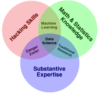
Regarding the level of expertise opinions range from having to have a PhD in math, machine learning, stats or something similar, to “just” being able to know how a regression analysis works. As a company I would be really careful about hiring a top data scientist with a PhD who is an absolute expert in all of the above mentioned areas, a jack of all trades so to speak. First of all, recruiting and employing someone like this is really costly, because this breed of people is very rare. You will find someone with excellent math and hacking skills, but then business acumen and skills might be lacking. Secondly, such an outstanding person will most likely develop into one of the most important colleagues in the whole company and act as a swirl, sucking in all kinds of business processes into her “spehre of influence”. That’s good, as long as everything is running smoothly. But if this data scientist is acting as a “data princeling”, a gatekeeper, not letting anyone else besides her team onto the data, and asking for a significant pay raise, then things get complicated. I’d rather have a team of colleagues who have an expertise in "only" two of the above mentioned areas, but I am sure processes are backed up and access to data is available to everyone in the company.
The below interview with DJ Patil on being data driven and data scientists is a must-see. I love the part when he’s talking about being datasmart means to be streetsmart: Instead of throwing all
your AI and machine learning algorithms at one problem, sometimes using a simple heuristic might be a smarter and more efficient way to solve a problem. In Patil’s opinion being a good data
scientist is more about personality than about specific skills.
What is big data?
How would you define Big Data? Big hype, Big BS? The best definition I heard thus far is from George Dyson, who recently stated at the Strata conference in London that the era of big data started “when the human cost of making the decision of throwing something away became higher than the machine cost of continuing to store it.” What I like about this definition is that it is a more abstract framing of the term and therefore has a broader validity. It implies a relation between two kinds of costs and thus does not depend on absolute values in terms of TBs. Classical definitions you can find on wikipedia talk about big data being “a collection of data sets so large and complex that it becomes difficult to process using on-hand database management tools.” How will “on-hand” databases look like ten years from now and won’t they be capable of easily process what we today consider to be big?
There are also the three “Vs” that are suppose to be typical for Big Data: Volume, Variety and Velocity. We talked about volume being a moving target, dozens of tera bytes, peta bytes, whatever. There are sectors that have dealt with what today is considered to be big data long before the term big data has been coined. For example scientific data volumes have always been among the largest, just think of the vast amounts of data that are beign processed at CERN (one petabyte per second) and in the LHC Computing Grid (many petabytes per year).
Variety is something that has been managed in the past as well, before big data became such a hype. As a data miner you always look for new and different data sources to increase the quality of your models and the amount of variance the model can explain. When I worked at Otto we looked into integrating messy call-center data and weather data into models which would predict customer responses, i.e. sales, for more efficiently sending out catalogues. At xing we found a way to integrate the non-standardized tags with which a user can describe his profile (wants, haves), which definitely would fall under the data variety aspect (see paper).
Thus in my opinion the most noteable aspect of big data is velocity: the aim is to get away from daily batch processes updating your data, analysis and models once a day, to online streaming updates. A good example for such a use case are recommender systems, whose underlying models shouldn’t be updated only once a day but online to reflect the current trends in user behaviour. If users suddenly started buying product z with product a, you don’t want to wait until the next day to update your recommendations. You would lose sales by not recommending product Z to users who already looked at product A but not Z. Another example is the notorious prediction of click-through-rates (CTR) in online marketing environments. This is done to decided which ad to serve or to determine how much to spend for an ad. Here is another interesting use case of real time analytics:http://userguide.socialbro.com/post/16003931427/how-can-real-time-analytics-for-twitter-be-useful-for-yo. One of the more important technologies with regard to stream processing of data is Storm (http://storm-project.net/). The most promiment user of Storm is Twitter, which acquired the company that developed Storm, BackType, in 2011.